The name
deebeo is written in lowercase, always, including at the start of a sentence. It is one word: never Deebeo, DeeBeo, DEEBEO or dee-beo.
It is pronounced dee-bee-oh, because that is what it is: the letters d, b and o spelled the way they sound. They stand for design, build and operate, the three things deebeo does, in that order, over and over.
"dbo" is shorthand for those three stages when talking about the work. It is not a name. Don't use it as a brand, in a logo, or in place of deebeo.
The mark
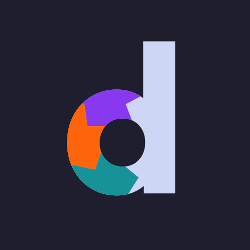
The mark is the lowercase d of the wordmark, the same letter in the same face, whose bowl is a loop of three colours: design at the top, build on the left, operate at the bottom. The stem is the backbone the loop leaves from and returns to. Every colour boundary is a chevron pointing along the flow, so the mark carries its own direction: design, build, operate, repeat.
Anatomy
Versions
On light

On dark

One colour
currentColor. Same silhouette; the chevrons only exist between colours.The loop's three colours are the same on every background; only the letter changes, taking the text colour the way type does. So use the light version on light backgrounds and the dark version on dark ones. They are not interchangeable: the stem is the theme's text colour and disappears on the wrong ground. Use the one-colour version wherever colour is unavailable or unreliable: print, engraving, a monochrome UI, a watermark.
The logo
The name, with its d as the mark

deebeo-logo.svg, with -dark and -mono versions. Use it wherever the name appears: page heroes, title cards, navigation, print.Mark alone
The wordmark is Outfit Bold with tight tracking, stored as outlines in the files, and deebeo Sans produces exactly the same thing when you type the name. Never retype it in another font, and never put the mark next to a typed "deebeo": that reads as a stutter, two d's in a row.
Clear space and size
Clear space
Minimum size
Don't
Don't stretch it
Don't rotate it
Don't recolour it
Don't use the light version on dark
Don't add effects
Don't outline it
Also: don't pull the segments apart, don't use one segment on its own, don't put the mark inside a circle or badge of your own, and don't place it over photographs or busy backgrounds. If a surface can't take the mark cleanly, use the one-colour version or the wordmark alone.
Colour
deebeo uses Catppuccin: Latte on light backgrounds, Mocha on dark. Both themes are first-class; everything is designed and checked in both. The neutrals follow the theme. The three stage colours do not: they are the mark's, and a mark keeps its colours wherever it goes. Swatches with two chips show Latte on the left and Mocha on the right.
Roles
Neutrals
How to use it
- Neutral first. Pages are base, text and muted text, with mantle for secondary surfaces and surface0 for borders. Most screens should have no colour at all except the mark.
- The three stage colours belong to the mark, and they never change. Not with the theme, not with the surface: mauve, peach and teal are the same hex values on light and on dark, and only the letter reverses. On the site, peach (build) is the one interactive accent: hover and focus states, in both themes. Mauve and teal are reserved. Use them only when you are literally talking about design or operate, such as a label or a chart series for one of the stages.
- Never split the three across unrelated things. They read as a set. Using mauve for "warning" or teal for "new" would make the mark mean less.
- No gradients, no tints of the stage colours, no new colours. If something needs a colour that is not here, take it from the Catppuccin flavour in use and write it down here.
Contrast
WCAG contrast against the theme's base. Text needs 4.5:1 (3:1 for large text, 3:1 for UI borders, icons and graphics). The neutrals are measured as their theme's value; the stage colours are one value measured on both grounds.
| Colour | On light | On dark | As text on light | As text on dark |
|---|---|---|---|---|
| text | 7.1 | 11.3 | yes | yes |
| subtext0 | 4.4 | 7.4 | yes, not below 1rem | yes |
| mauve | 4.8 | 3.0 | yes | large text only |
| peach | 2.6 | 5.5 | no | yes |
| teal | 3.3 | 4.4 | large text only | large text only |
All three stage colours clear the 3:1 bar for graphics on both grounds, which is what lets the mark keep its colours everywhere; mauve on dark is the closest call. As words they are fussier: on light, peach and teal are fills, borders and icons, never text; on dark, mauve and teal are for large text at most. That is why the site's peach accent is a border on hover rather than a link colour.
Typography
Two faces. Outfit for the wordmark and headings: a geometric face whose d is the mark itself. The system UI stack for everything else: body, labels, controls. It is native, fast and never looks like a decision.
brand/build.mjs for paths, commands and code.- Headings are sentence case. Never Title Case, never all caps (the eyebrow label is the one exception, and it is small).
- Outfit is for display sizes only, 1.125rem and up. Don't set body copy in it.
- Tracking: −0.02em on big headings, −0.01em from 1.5rem down, none on body. Only the eyebrow is tracked open.
- Load Outfit from Google Fonts with weights 500 and 700 only, and always give it the fallback stack
"Avenir Next", "Helvetica Neue", Helvetica, sans-serif.
The font
deebeo Sans is Outfit Bold with the mark built in as a lowercase d, so the name can simply be typed. It is a colour font (COLR/CPAL): the stem and all other text take whatever colour the text has, and the three stage colours come from a palette inside the font, the same on light and dark.
- The swap is automatic and precise. An OpenType rule turns a d into the mark only when "eebeo" follows it, so running text keeps its ordinary d's. To make every d the mark, turn on stylistic set 2:
font-feature-settings: "ss02", or "deebeo mark for every d" in an app's OpenType menu. - Use it where the logo file can't go: the name inside a sentence, a slide title, a document heading. Typed in deebeo Sans, "deebeo" is the logo. The site's hero still uses the SVG, which needs no font to load.
- It degrades safely. Where colour fonts aren't supported (some older or smaller apps), the d is Outfit's plain d and nothing else changes.
- On the web:
@font-face { font-family: "deebeo Sans"; src: url(fonts/deebeo-sans-bold.woff2) format("woff2"); font-weight: 700 }. Nothing else to set for dark mode: the letter follows the text colour and the loop keeps its own. - On the desktop: install
deebeo-sans-bold.ttf. Bold only, the wordmark weight. Like Outfit, it is under the SIL Open Font License.
Layout and surfaces
- One column, forty rem. Reading content sits in a single column no wider than 40rem, left-aligned, with generous space above and below. Wider layouts (like this page's grids) are for galleries of things, not for prose.
- Space in rem, on a quarter-rem grid. 0.25, 0.5, 0.75, 1, 1.25, 1.5, 2, 3, 4. Vertical rhythm comes from margins, not from empty elements.
- Surfaces are flat. The page is base. A secondary surface (a footer, a code block, a card that needs to recede) is mantle. Borders are 1px surface0. There are no shadows and no gradients.
- Corners are 0.5rem on controls and 0.75rem on cards. Nothing is fully round except things that are circles.
- Both themes, always. Colour comes from the variables, never from literal hex values in a component, so light and dark are one set of styles. Check every screen in both before calling it done.
- Hit targets are at least 44px on touch, and focus is always visible: the same peach border as hover.
Components
The site is small, so its component set is small. These are live, drawn with the page's own styles.
Buttons
One primary action per view, drawn inverted: text colour as the fill, base as the label. Everything else is secondary: a 1px surface0 border that turns peach on hover and focus. Labels are short verbs or nouns, sentence case, no trailing punctuation.
Links
Inline links look like this: the text colour, underlined in surface0, with the underline turning peach on hover. Links are never coloured words; on a light background the accent colours don't pass for text.
Code
Inline code sits on mantle with a small radius: deebeo.com. Blocks are mantle with a surface0 border:
node brand/build.mjsVoice
A starting point, to be sharpened as deebeo publishes more. The short version: write the way the mark is drawn. Plain shapes, nothing decorative, and the meaning is in the structure.
- Say what it does. Lead with the thing, not with how we feel about it. "A static site generator for notes" beats "A powerful new way to think about writing."
- Short sentences, one idea each. If a sentence needs a semicolon, it is two sentences.
- No hype words. Not seamless, powerful, revolutionary, next-generation, cutting-edge, robust, or world-class. If something is fast, give the number.
- Design, build, operate are verbs. They describe work in progress, not a slogan. Use them when they are true and leave them out when they are not.
- Lowercase deebeo, sentence case everything else. Headings, buttons, labels.
- Admit the state of things. Experiments are called experiments. Unfinished things say what is missing.
Assets
Everything is in the brand/ folder of the site repository, generated by build.mjs from one geometric description. The README there has the full construction spec, the colour table, and the round-by-round history of how the mark was designed.
| File | Use |
|---|---|
deebeo-logo.svg · -dark · -mono | The logo: the name with its d as the mark. |
deebeo-mark.svg · -dark · -mono | The mark alone, optically centred in its square. |
deebeo-tile-512.png · deebeo-tile.svg | The mark on a Mocha square for avatars (GitHub, social). Platforms round the corners. |
/favicon.svg · /favicon.ico · /apple-touch-icon.png | Site icons. The SVG follows the OS theme. |
fonts/deebeo-sans-bold.ttf · .woff2 | deebeo Sans: Outfit Bold with the mark as a lowercase d. TTF to install, WOFF2 for the web. |